Great products aren't just built.
They’re designed.
That’s Why We Do What We Do.
Get in TouchPrivacy Policy
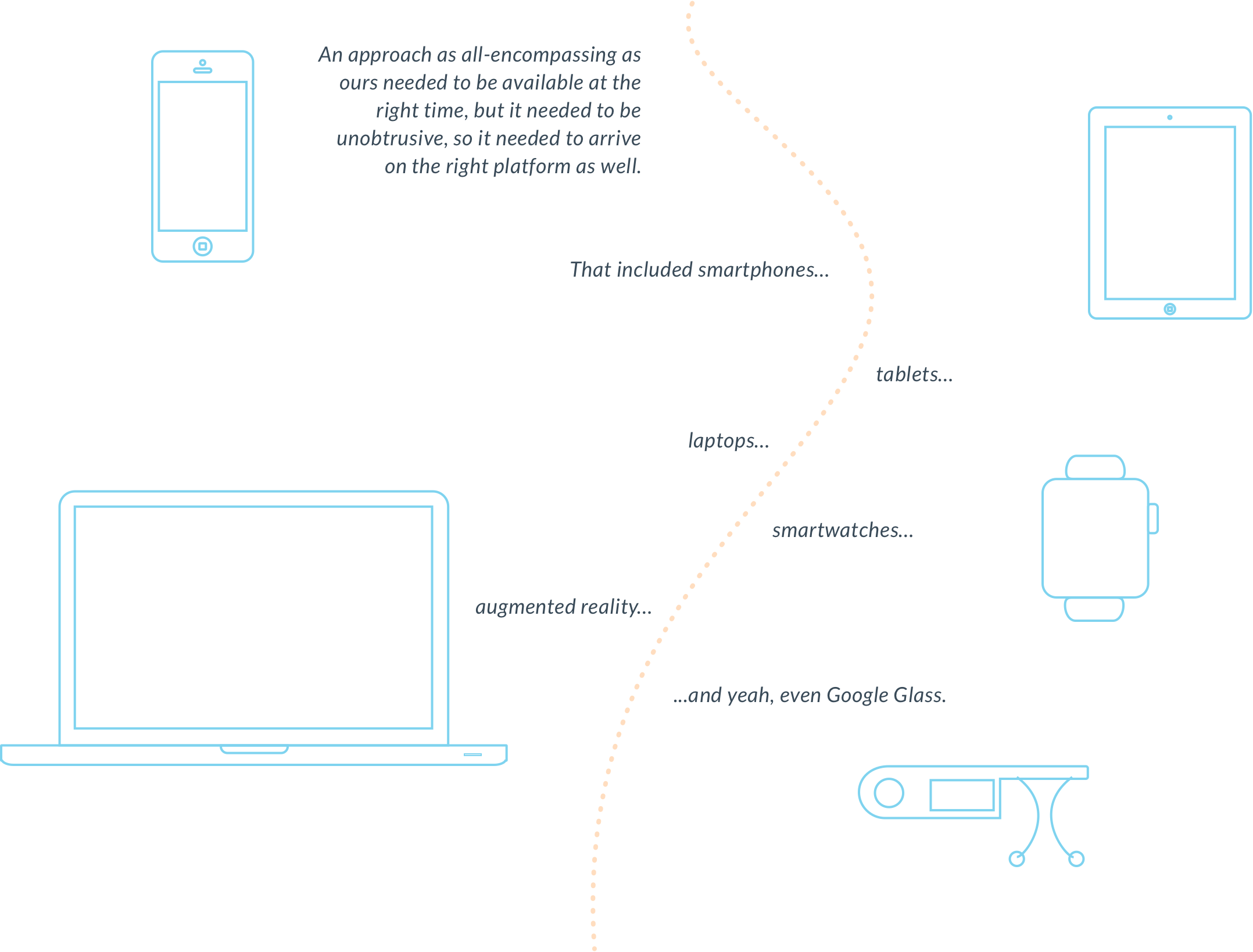
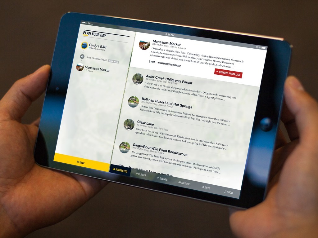
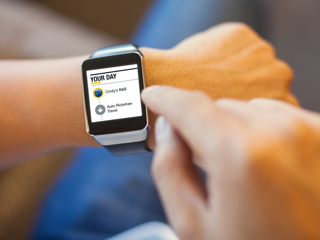
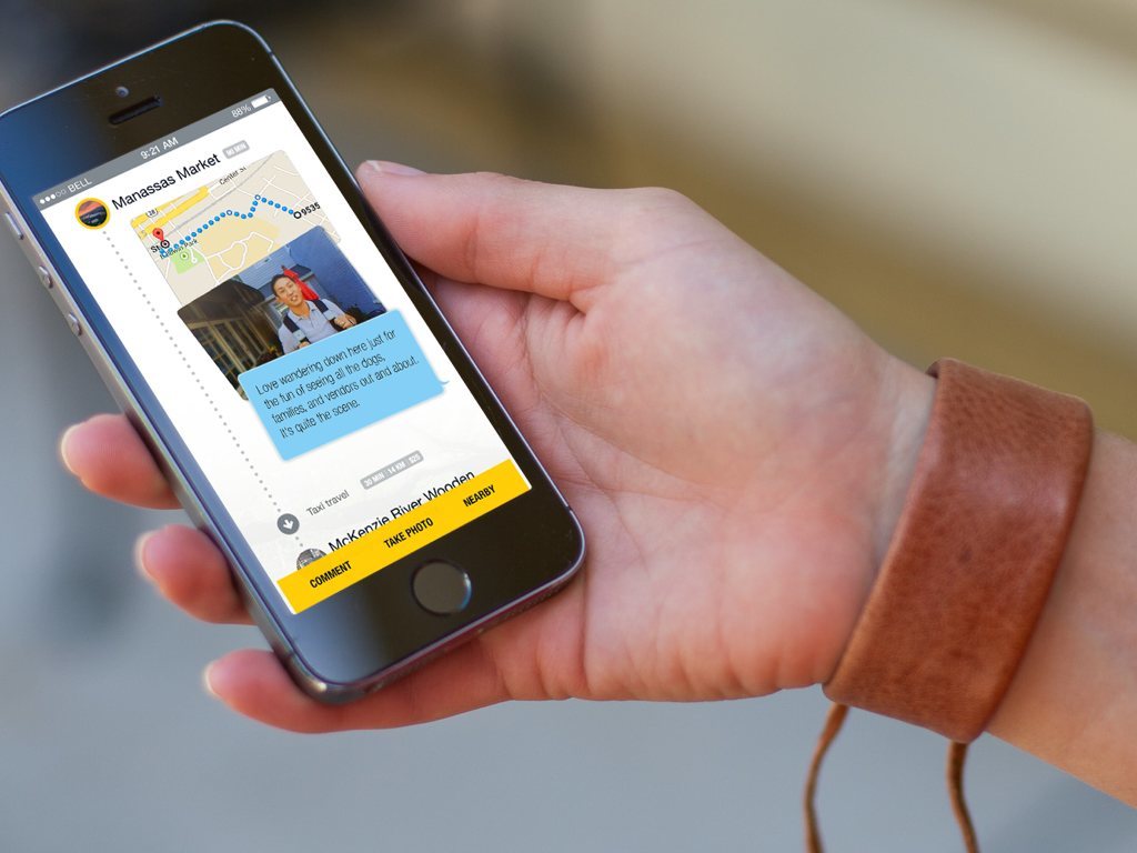
We conceived a geotourism application that tied together tablet, smartphone, smartwatch, and Google Glass into a single, user-centered experience.
We embarked on an exploration to reimagine the travel experience.
Geotourism is kind of broken.
Experiences either have gaps, or they’re overly intrusive and end up detracting from the real-world travel experience.
To make matters worse, most geotourism software takes on a single portion of the process instead of creating a unified approach.
So we explored some solutions.
A lot of solutions, actually.
 Some thoughts were ridiculous, like teleportation.
 We built our experience across a range of platforms.
We’re pretty proud of what
we came up with.
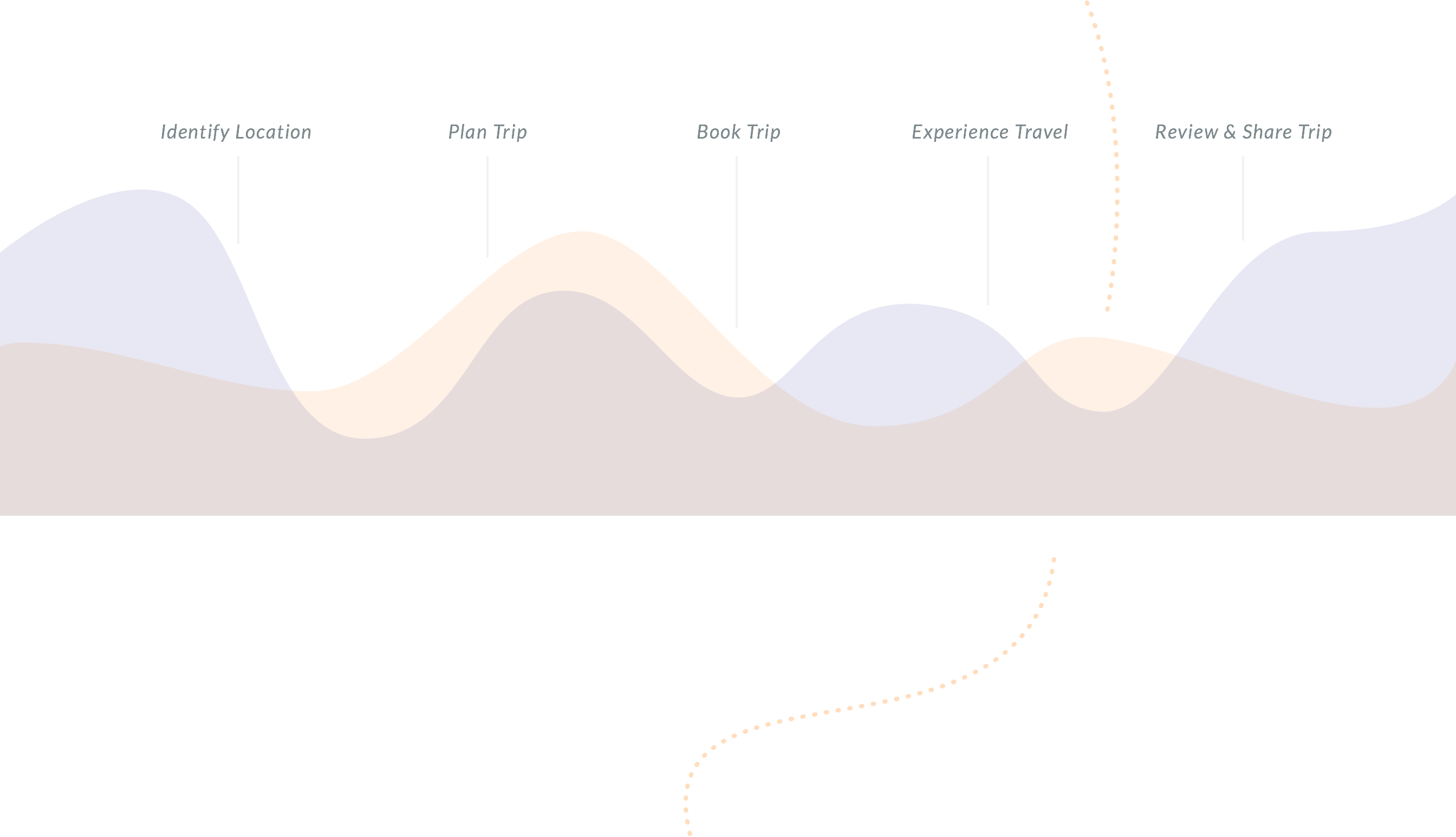
What we finally came up with was a simple, integrated experience across a traveler’s journey.
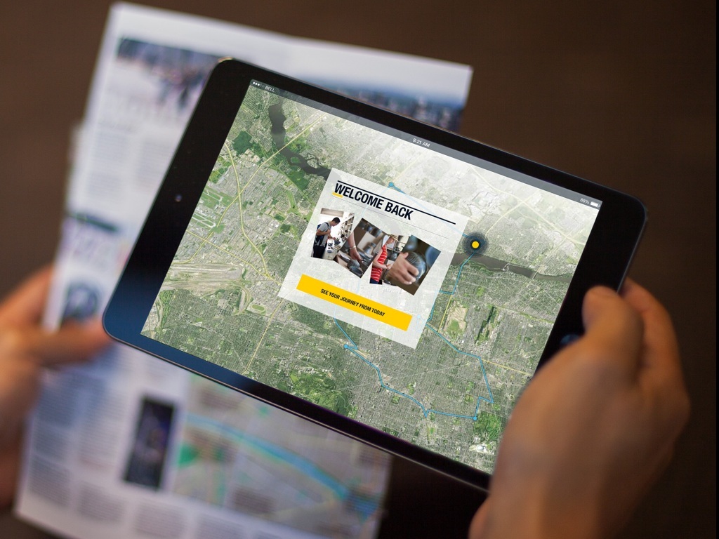
…a collection of seamless interfaces that allows a user to discover, experience, capture, and share their special moments.

The story starts with a young couple who lands in this new town.



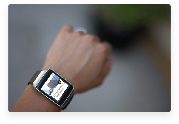
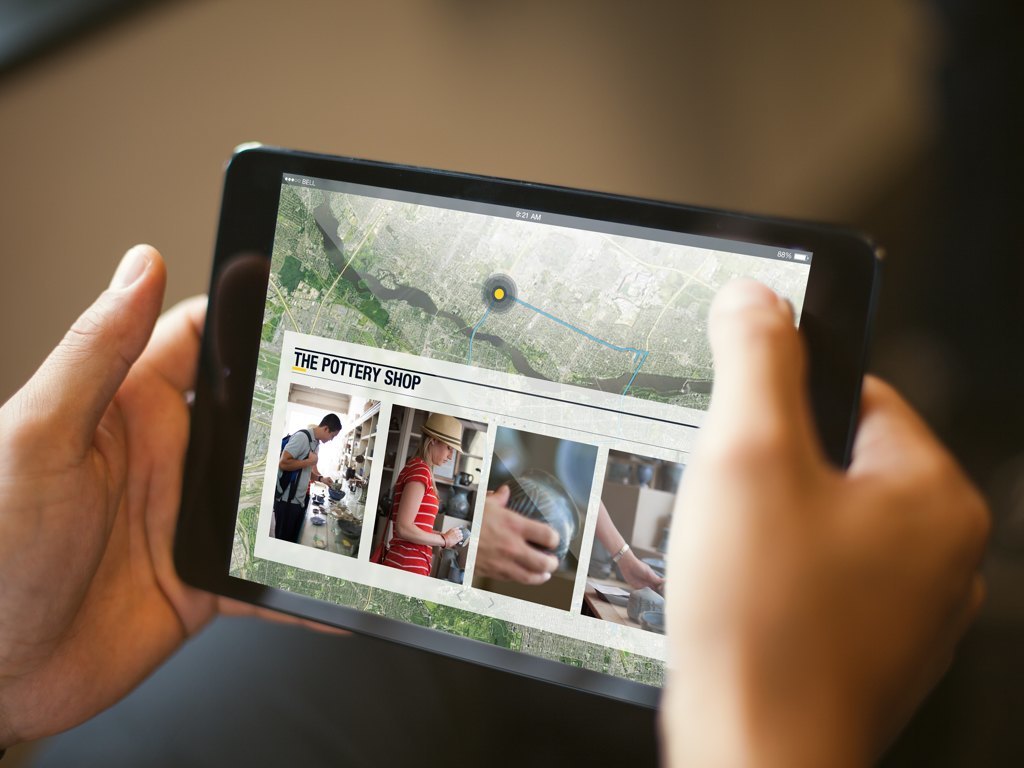
The watch is also used to send location- and interest-based alerts. As our young couple is close to an old pottery shop, we send them an alert based on their past travel, because we know they enjoy such places.

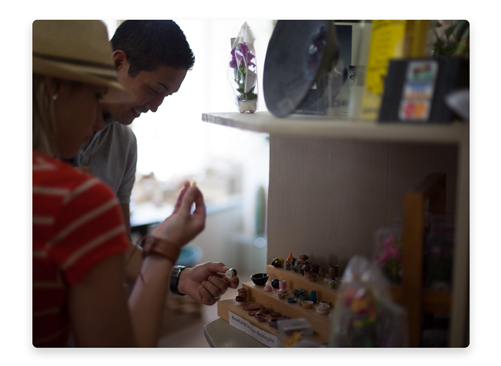
They discover something new - something they didn't plan for. It
ended up being the highlight of their trip.

A large enterprise telecommunications provider had an idea that their product
should be made more personal, more helpful, and more intuitive.
We set out to create a design strategy
inspired by a personal assistant.

Our work was backed by user research
and testing, delivered in agile
design methodologies.

Creating a Design Personality

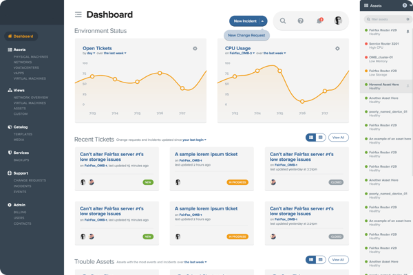
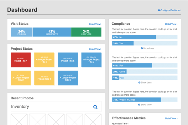
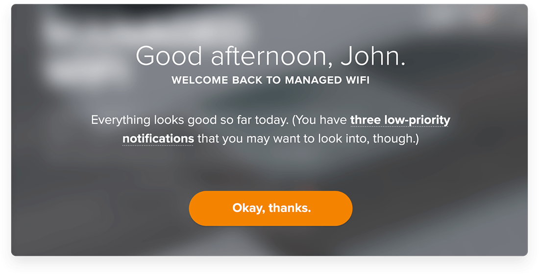
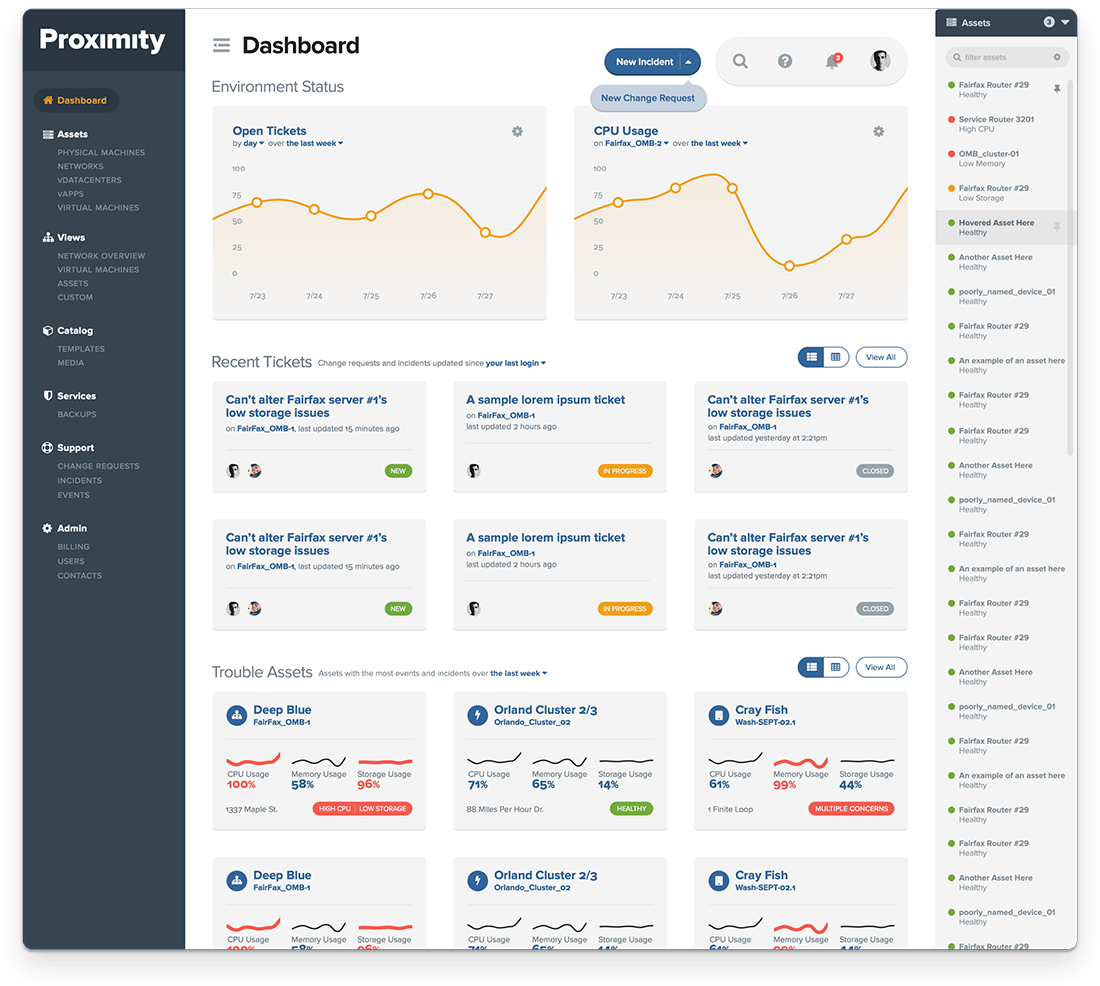
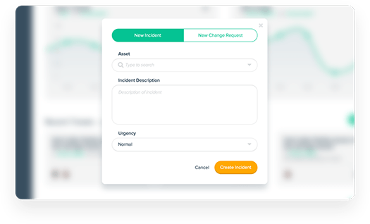
We designed an intuitive dashboard with at-a-glance status
information for system administrators to manage virtual servers.
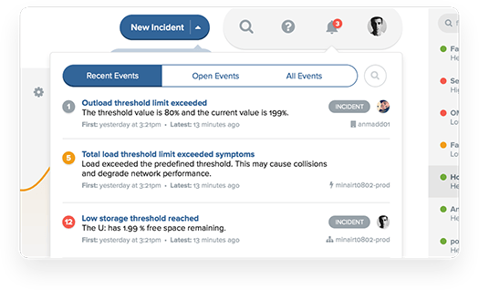
Instead of just showing a lot of charts, we created an experience like
that of a personal assistant's greeting and highlight what is important.

The system administrators could still access all the wealth of data,
through a Dashboard. The Dashboard clearly prioritizes all information
and allows the user to scan quickly and identify what’s important to them.

Not just design, but a full Design System.
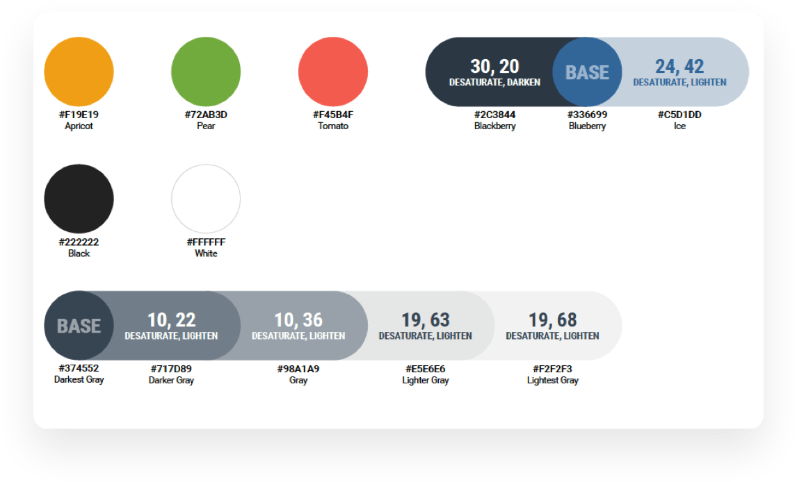
The design that we created forms a foundation for multiple products. To enable this in an efficient manner, we are building a Design System which includes the core design architecture, presentation details, and also the operational elements such as processes and tools.
We implemented a responsive framework, delivered on Bootstrap at its core. We also expanded user experience practices across all disciplines from design delivery to research and testing.

We think it turned out pretty well.
“I think it is fair to say we accomplished a lot,
and – in some cases – we are on the cusp of
having best-in-class portals for our customers.”
DIRECTOR, MARKETING INTELLIGENCE
What kind of mobile application makes sense for students in today’s age?
College planning in the palm
of your hands.
About 1 million students use the Common Application every year to make it easier for them to submit their applications to multiple colleges.
Every year over 3.5 million applications are submitted through Common App.
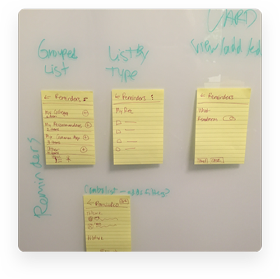
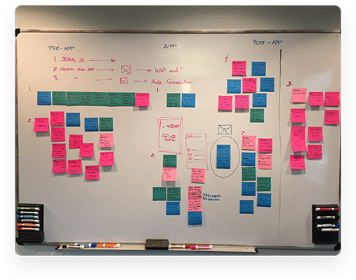

First, we got to know
Common App’s users.
We started with defining the overall objectives and understanding the audience.
We worked with Common App's Product management team to conduct over 40 student interviews.
WE GATHERED QUITE A BIT OF INPUT.
“I don’t even like shopping on mobile websites.”
“Even if you ignore reminders, it’s on your mind.”
“Reminders – something you can toggle yourself and create yourself."
“Students in underprivileged areas don’t understand the process of applying and that they can get in – it’s not a feasible option to them.”
“Most counselors don’t know us by name. They look at a paper or nametag.”
This research helped us to better
understand Common App itself.
This helped us learn what was really important for them, what kinds of terms and languages align with their world, and where mobile fits into their application experience.
Essentially, the process helped us understand a student journey through this very stressful time in their life.
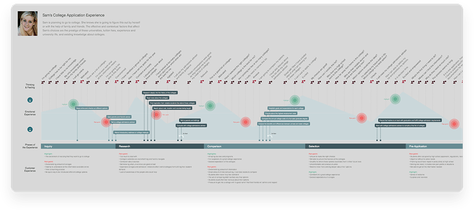

Ideation, prototyping, and testing.
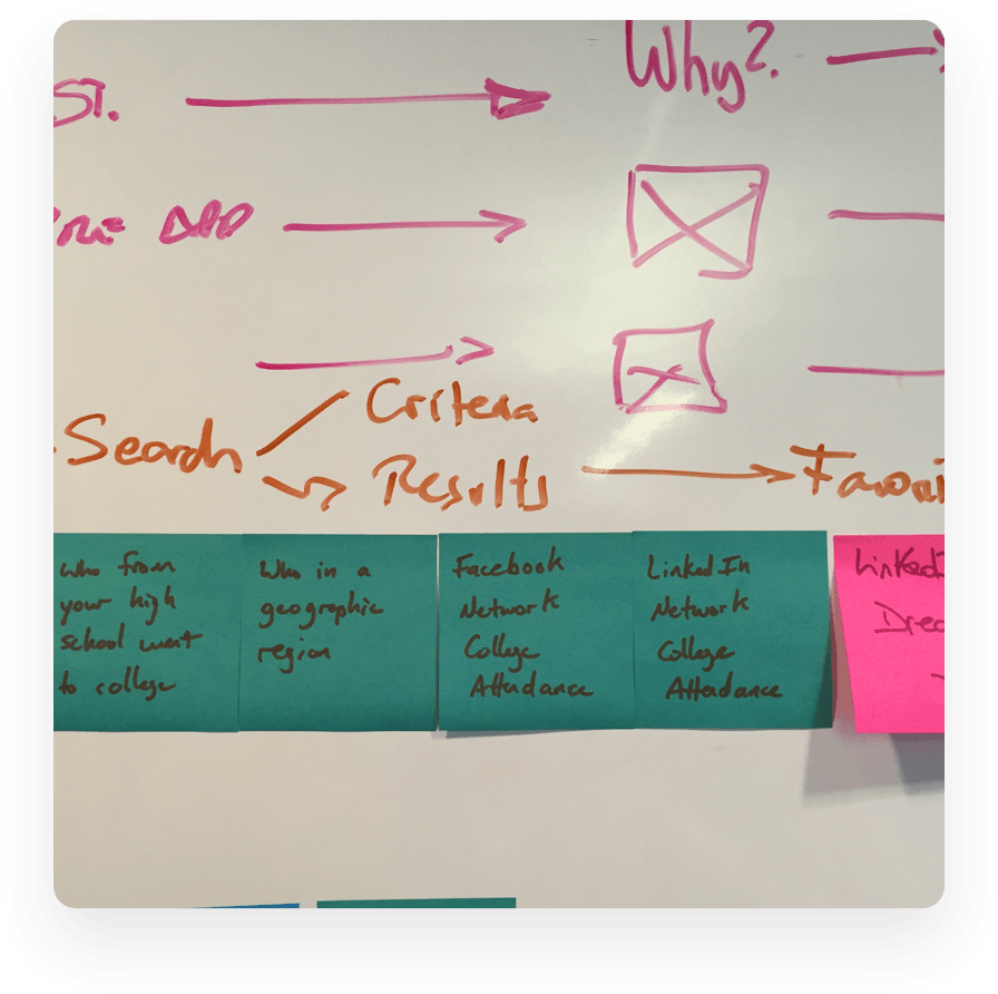
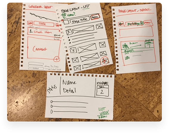
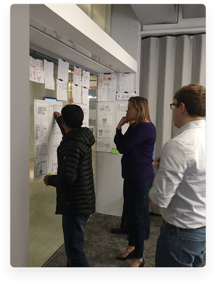
We conducted brainstorming sessions by bringing cross-functional teams together to sketch out many different ideas.
And, we explored multiple interaction models and tested them with real students.
We also shifted our testing times to the weekend, when students had more time to take out of their day to provide feedback.
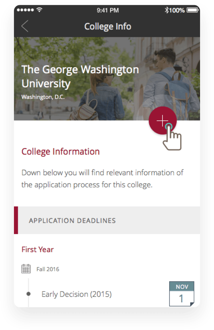
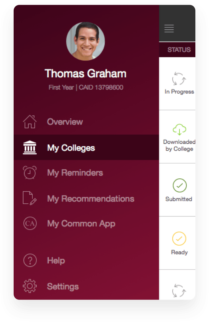
The application started to take shape, and we continued to design every detail of the experience.
Common App was quickly embraced by the community, gathering more than 4,000 downloads* from 90+ countries in its first few weeks in the App Store.
Usage was also fairly high – users visited an average of seven different screens within the app.
“Seriously – this is a clean and well done app. The due dates and the tasks are super helpful. Kids don’t always have their computers in meetings but they always have their phones on them.”
TARA D
*And zero app crashes.
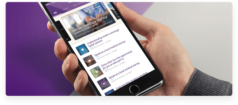
We worked with the nation’s foremost medical association to help create a mobile experience that would appeal to the next generation of practicing physicians.
Helping physicians serve
their patients better.
 The association is looking to appeal to a new generation of members with mobile offerings that improve their lives – and their membership experience – in some form or fashion.

We started with thoughtful research.
 This was critical; we knew we had to create a product that was immediately meaningful to its users. Otherwise, our busy target audience would quickly ignore it.
 This research allowed us to make
informed decisions in the design process.
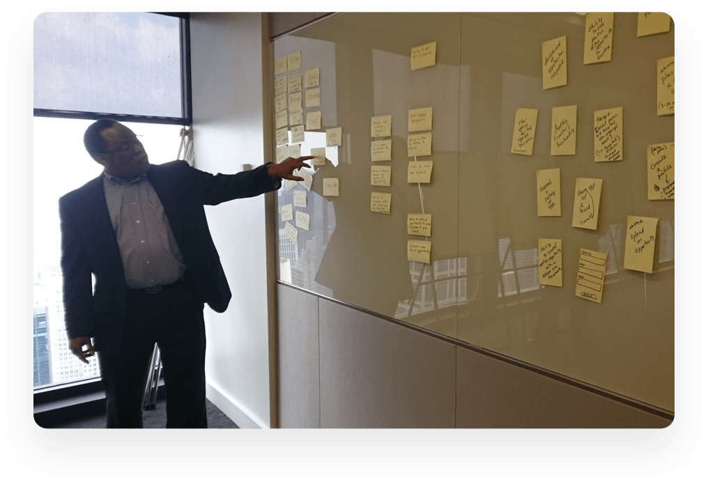
We worked with the association to understand some of the biggest pain points its members felt and where there were gaps in the membership experience.
We found that oftentimes there was a lack of knowledge around what types of opportunities to serve a doctor’s local communities existed.
As a result, we focused our efforts on better informing the doctors on where and how they could cooperate in their respective communities.
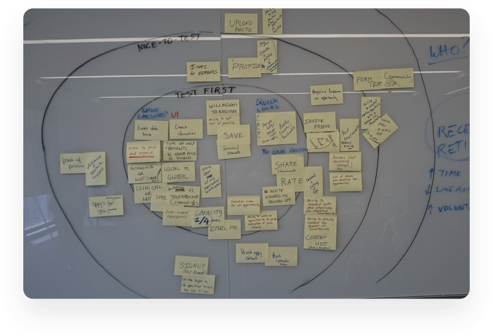

Next up, we needed to
validate our findings.
We conducted usability sessions by bringing prototypes straight to users and recording their feedback.
We found we’d hit the mark in a lot of areas.
…and that we’d missed the mark in a few areas too.
Rapidly iterating over only a few weeks, however, we were able to iron out any kinks and quickly produce an app that users absolutely loved.
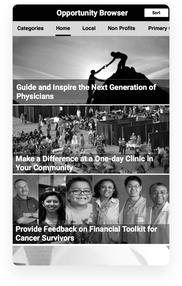
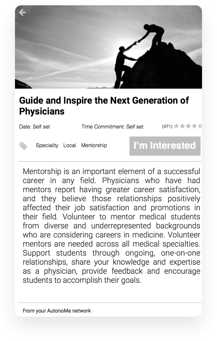
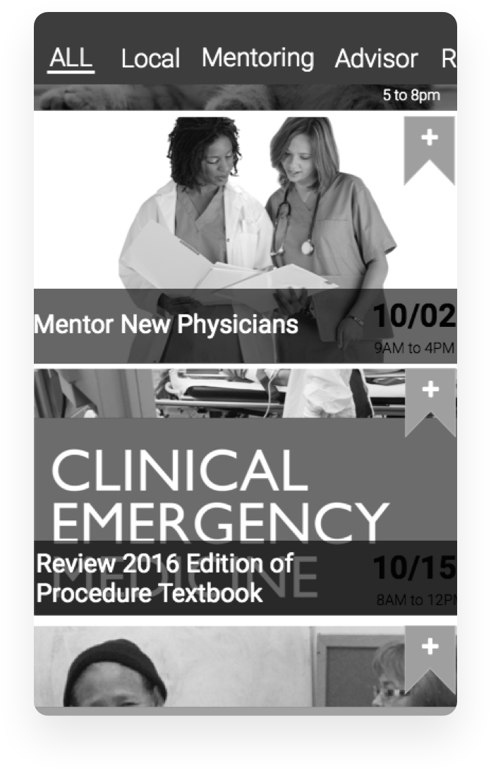

We’re quite proud of the end result.
 What we designed was a mobile experience that allows doctors to find opportunities in their area, learn more about those opportunities, and sign up to participate.
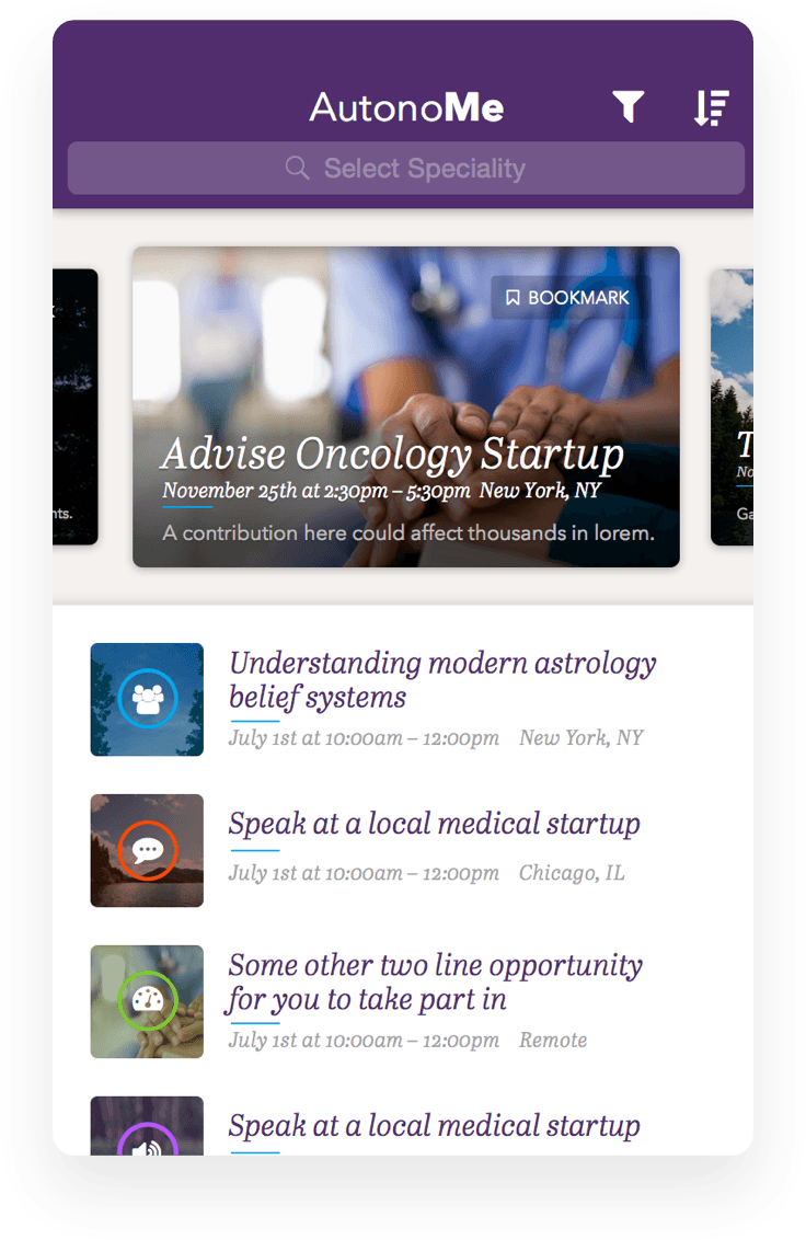
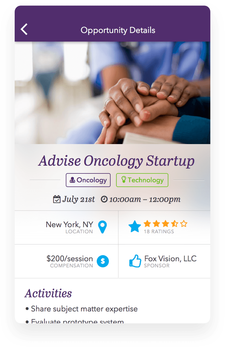
A PRACTICAL HANDBOOK FOR BUILDING GREAT DIGITAL PRODUCTS
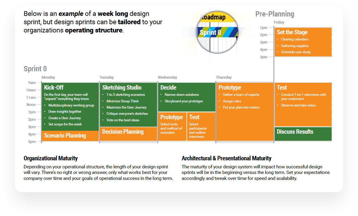
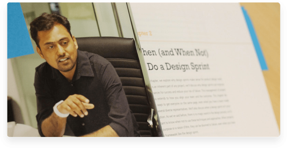
A number of members of 3Pillar’s team were recently featured in a book titled Design Sprint: A Practical Handbook for Building Great Digital Products. Written by Richard Banfield, C. Todd Lombardo, and Trace Wax, the book gives readers a playbook for how to employ design sprints in building and launching successful digital products.
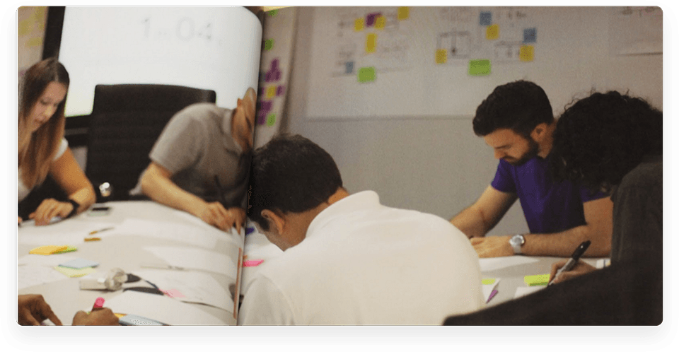

Design sprints are borne from the concept of development sprints in the agile software development world. They are meant to allow teams to prototype and test digital products within a week so that untold time and resources don’t get poured into projects before knowing if they have a chance to succeed. Design sprints foster collaboration and consensus amongst teams, business stakeholders, and even potential users of a product.

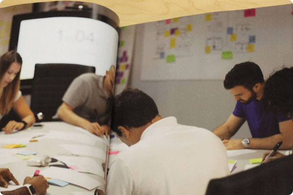
Numerous photos throughout the book were taken during a design sprint session at 3Pillar. Current or former team members whose photos are included in the book include Sarah Dickinson, Nate Weisz, David Rhyne, Jose Penaherrera, Dan Greene, and Alok Jain. Alok was originally approached by one of the book’s authors to provide photos based on an article he wrote in Smashing Mag titled Off To The Races: Getting Started with Design Sprints.

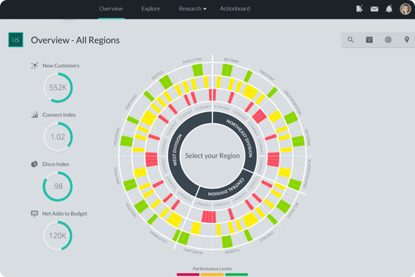
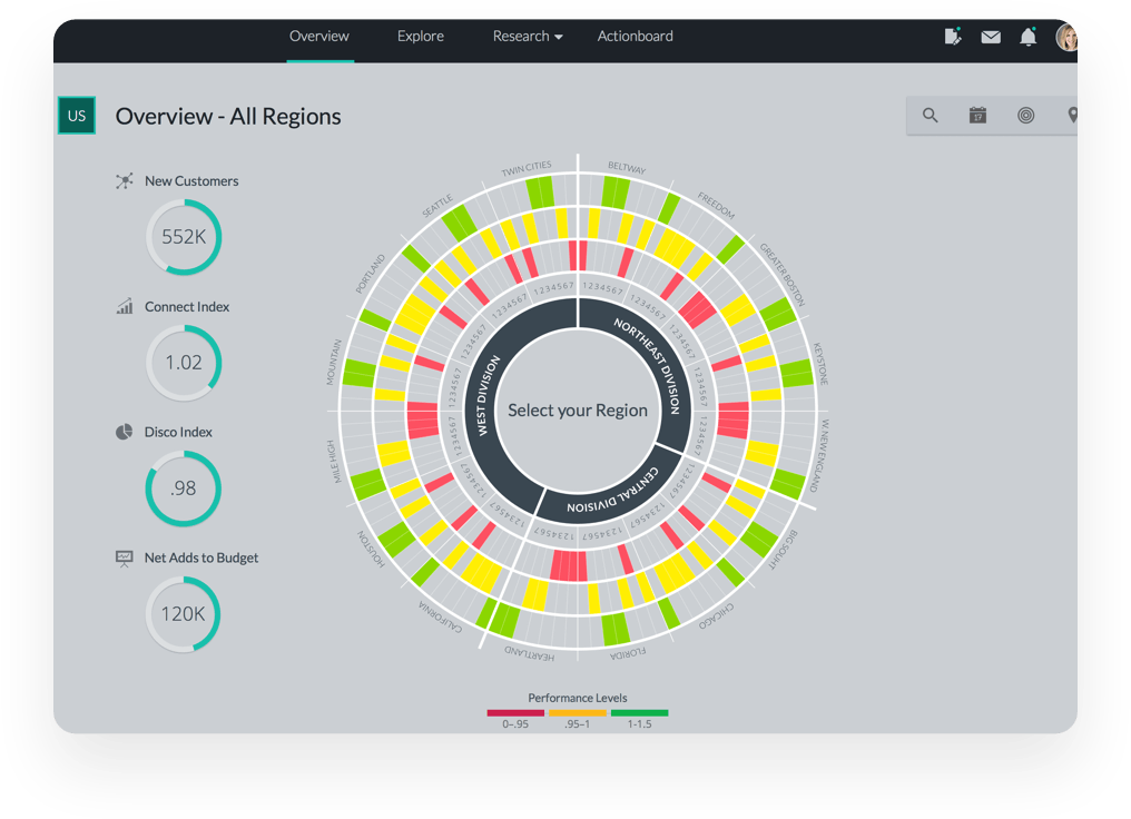
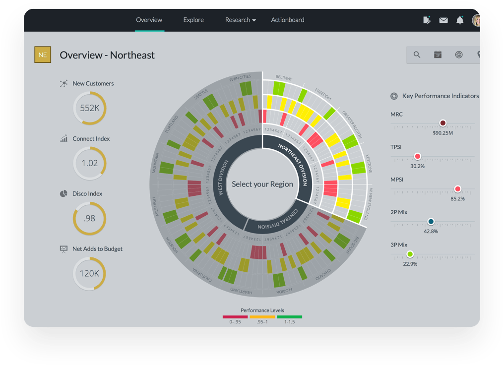
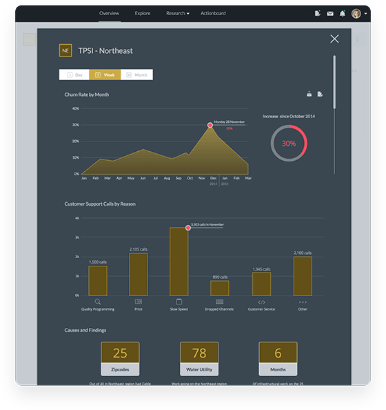
We worked with a Fortune 50 company to create a communication tool to present key pieces of data back to their C-Level Executives.
Using data visualization to
understand your audience.
A Fortune 50 company was looking for an effective communication tool to present key pieces of data back to their C-Level Executives. The data that they wanted to share lived in spreadsheets and small databases.
They were looking for ways to visualize this customer information to help bring the whole picture together.
For companies focused on providing a better user experience and business growth, one of the biggest sales opportunities is to identify where they can delight their customers.
However, the diversity of the data made it difficult to visualize, which made it challenging to increase revenue and improve their performance.
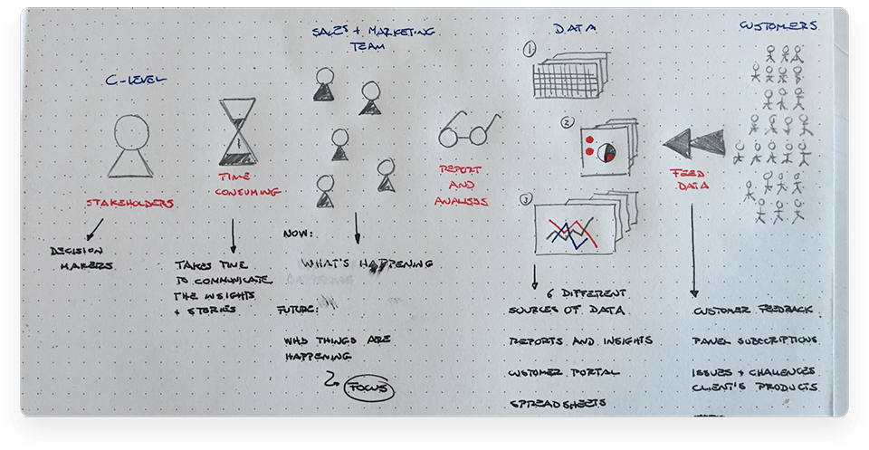

We began with research.
We soon became aware that one of the most valuable types of data available to the business is their customer data. This data has the power to create a change, but it needs to be visualized to understand the audience and show the main insights to decision makers.
Therefore, we conducted a systematic inquiry of the company and their customer data, to frame the problem in the right context.
From there, we began our
“Understanding” phase.
 We quickly found the trouble spots that would help the sales team to make a predictive analysis of their work. This allowed them to be more actionable and less responsive.
 WE SOON FOUND THE QUESTIONS WE NEEDED TO ANSWER:
What questions are users looking to answer?
What data do they need to answer that question?
Where is that data most likely to be found?
We followed up this new understanding
with rapid prototyping and iteration.
 First, we generated as many as possible solution ideas, regardless of how realistic, feasible or viable they may or may not be. From this explosion of ideas we found insights that became different sources of solutions and helped establish a clear design direction.
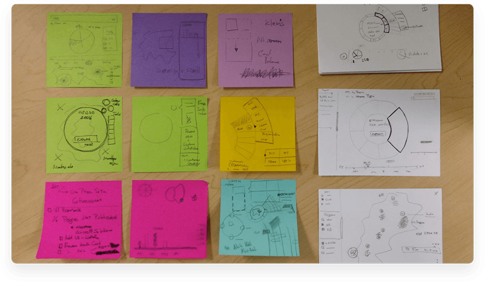
 After the ideation phase, as a team we looked at the most popular ideas and worked our way down to least popular ideas to identify key trends that seem promising. With these possible design solutions, we engaged in a conversation that led to a discussion about what type of prototype would do the best job of validating our ideas. As a result, we refined our ideas into a high-level mockup of the communication tool.

A simple, powerful solution.

In the end, this data visualization project allowed us to create a
visually engaging communication tool to enhance the user’s
experience as they build the story that they need to tell.
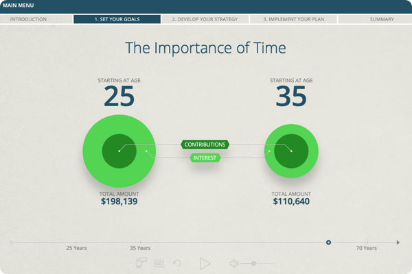
We worked with EverFi – a unique education platform that specializes in teaching
critical life skills – to create interactive financial literacy modules.
Reengineering eLearning.
Learning should be a constant in everyone’s life. It should also be as enjoyable and tailored as possible.
This is what EverFi and 3Pillar Global strove for.
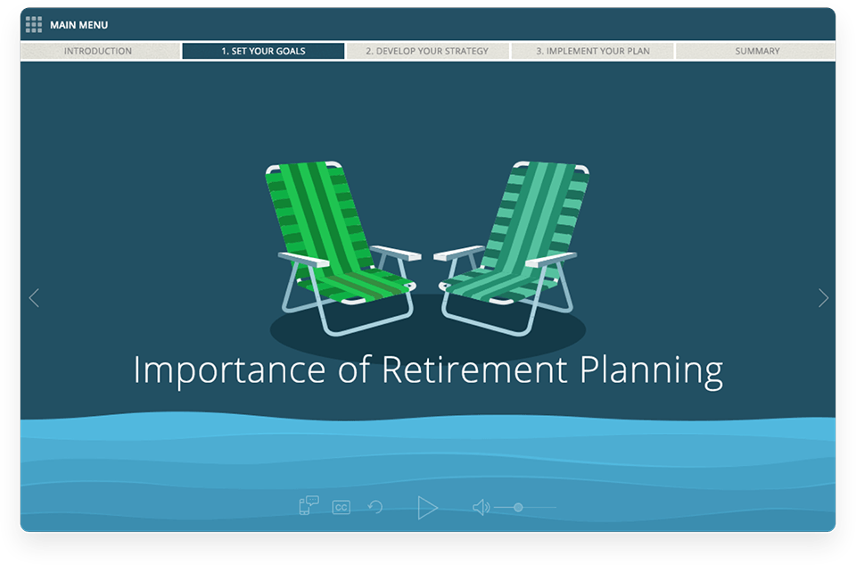
Learning the art of storytelling.
The modules we were creating were all about financial literacy, so we wanted to present these facts into a relatable story which would easily stick with the user long after they’ve left the platform.
Having a narrator meant that we could focus on the most important things for the user.

Treating users like humans.
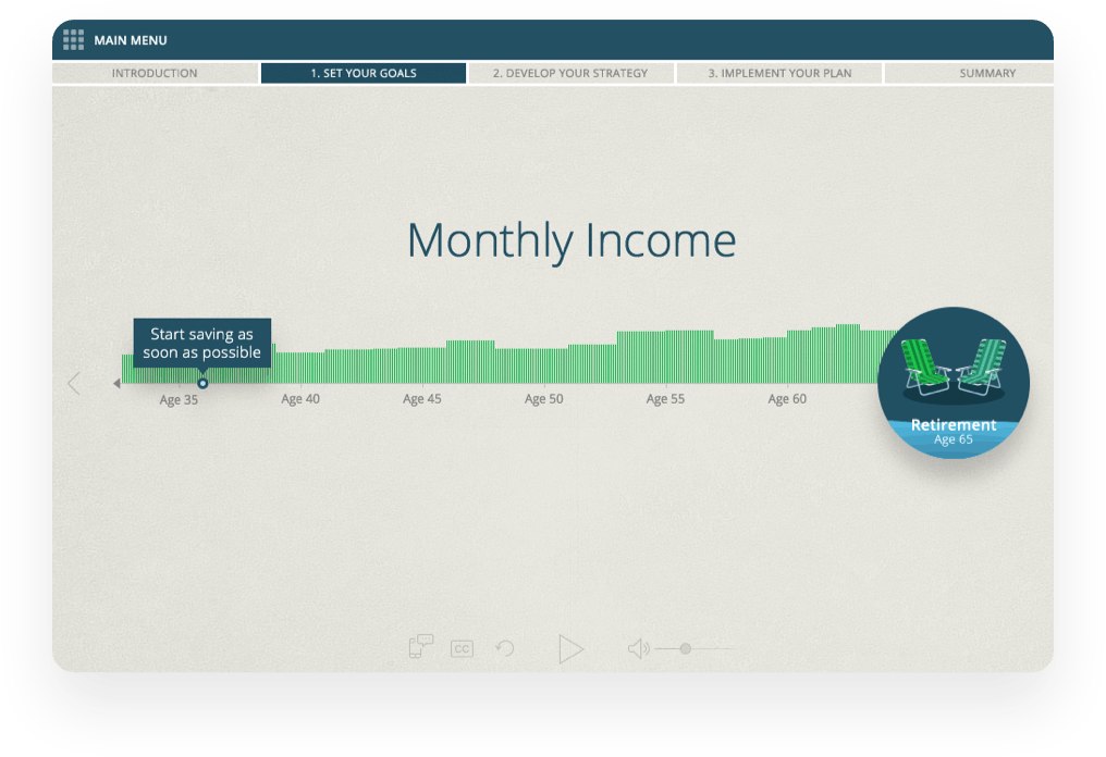
After bringing the narrator on board, we could break down the key aspects of the lesson with animation and engaging interactions.
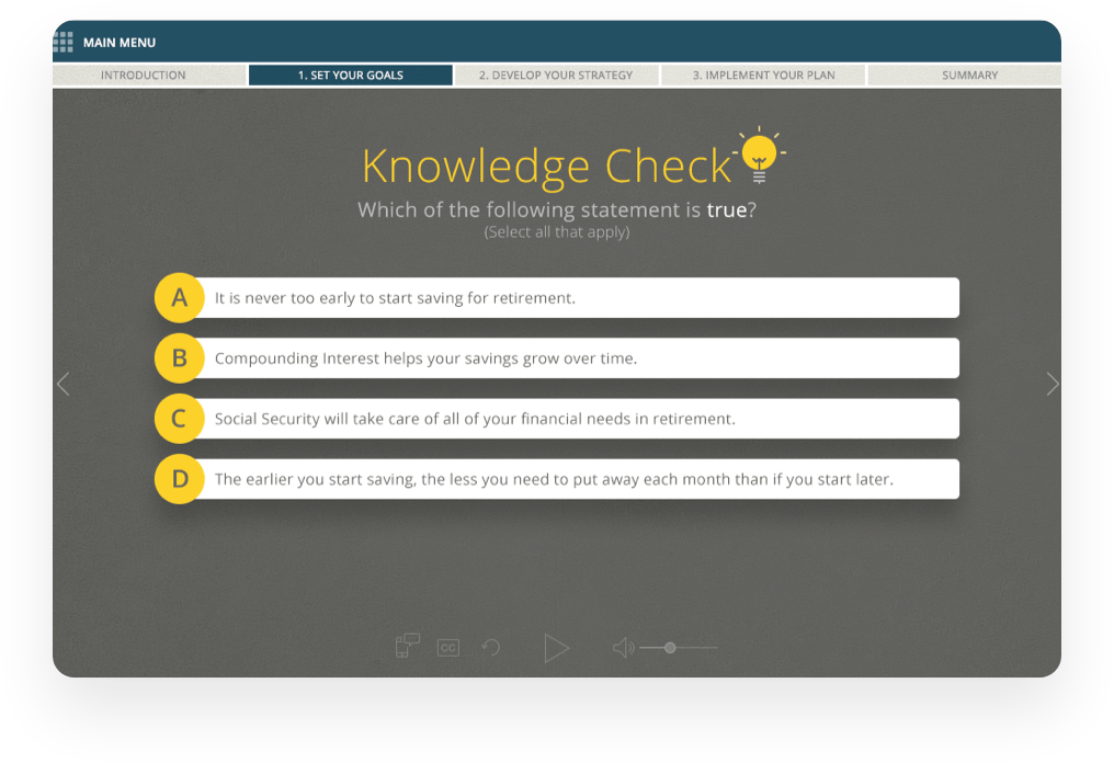
These interactions were critical, so we ensured that they were thoughtfully designed so that the user would feel invested in the process.
We achieved this goal by keeping the user’s personalized context involved along the way.
This, in turn, produced a personalized, contextual conclusion for each student.

Taking the right approach.
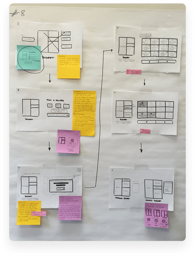
We soon developed a process for how we would approach the design and development of each education module.
First, we started with a script from EverFi.
From there, we would brainstorm the story’s flow – or, as we called it, the “storyline.”
The results of the brainstorming sessions were placed into wireframes along with interaction and animation plans.
After we settled into an approach that resonated well, we’d complete visual and high-fidelity designs.
These visuals weren’t just the icing on the cake, however – they were carefully chosen for each module to clearly convey the information presented.
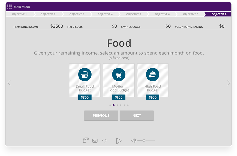
Over 80,000 employees use Natural Insight as an instruction guide for their job. If you’ve ever visited a major retailer or grocery store, you’ve likely seen the work of somebody that’s utilized NI’s hourly workforce management platform. Over the years, over 31,000,000 assignments have been scheduled.
Helping employers understand the
current status of their workforce.

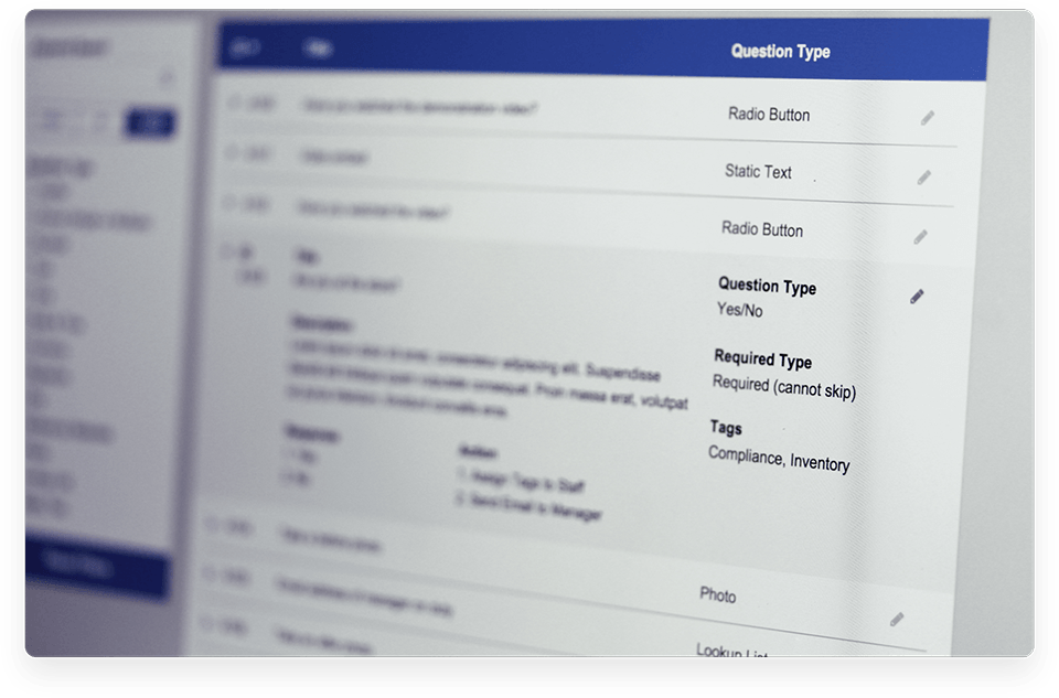
 We needed to work with NI to gain an understanding of their product, their audience, and what the desired outcome of our engagement was.
 We started by researching the market.
More specifically, we started by working with NI to gain an understanding of their product, their audience, and what the desired outcome of our engagement was.
We then worked with Natural Insight’s product team to conduct over 20 initial user interviews ranging from executives to IT professionals.
With this research in hand, we could
begin to understand the problem.
Natural Insight was looking for a way to improve the reporting functionality within their current system.
We initially assumed that a majority of the recommended changes would reside within the backend, but initial assessments and interviews invalidated that theory.
A big part of the NI platform is based around employees following tasks as prescribed by a survey/instructional system, however the data that was the output from these surveys wasn’t normalized or standardized in any way, making data analysis/comparison difficult.
In order to facilitate any meaningful change within their data aggregation and report generation, the way their surveys were created would need to be fundamentally altered.

From there, we moved to rapid
ideation and prototyping.
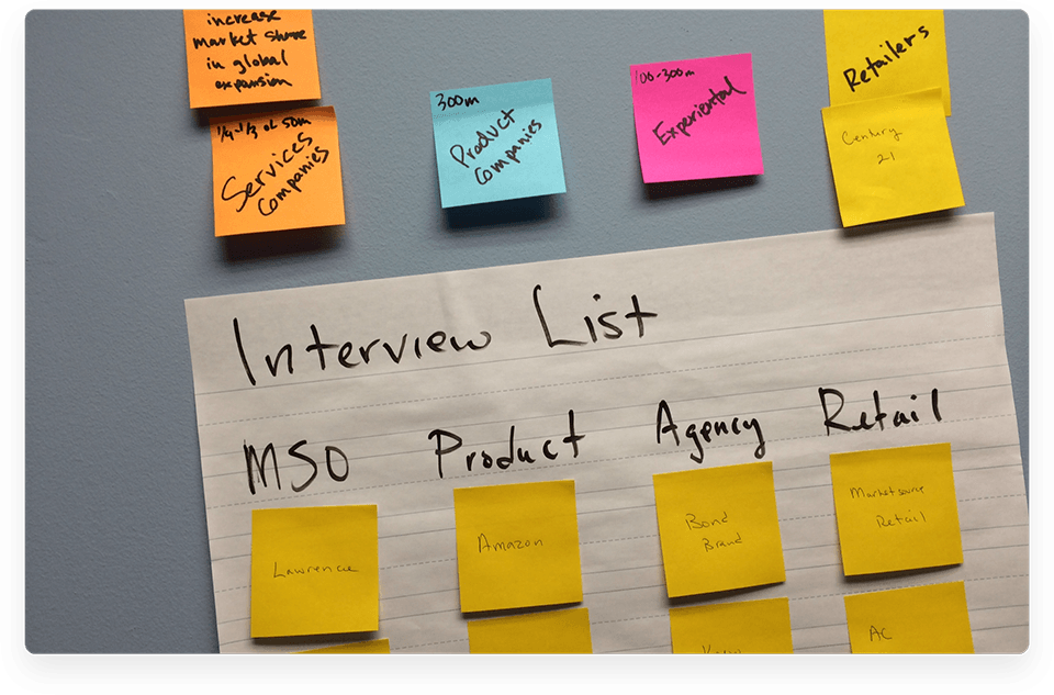
Over the course of several brainstorming sessions with NI’s product manager and our internal team, we decided that a revamped survey tool would be a key component to allowing for easier analysis.
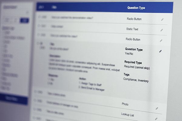
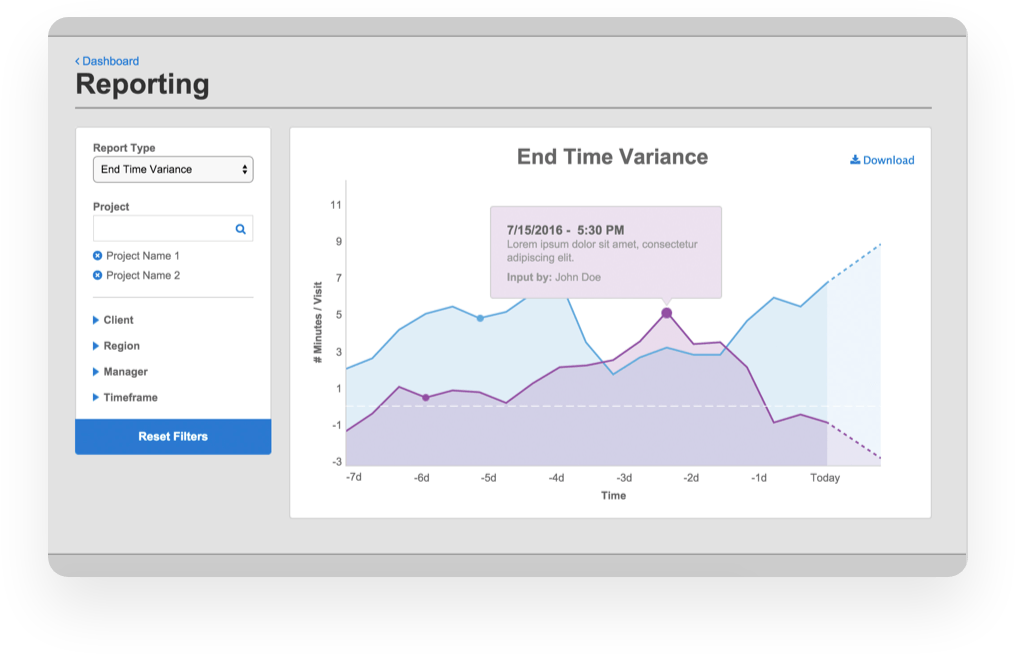
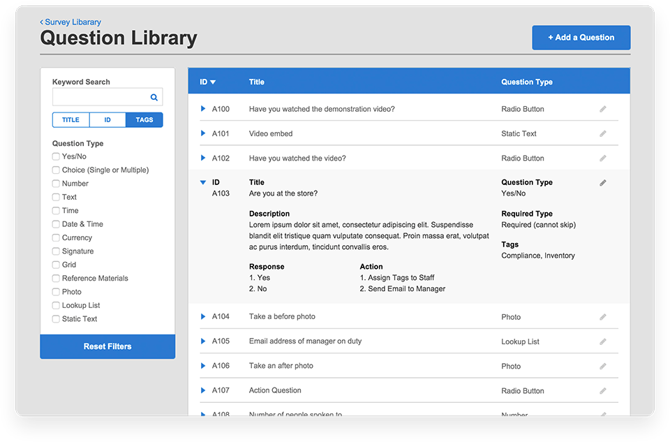
Over the course of our design sprints, we focused on three main segments of the prototype: a new survey template creation tool, a question library, and a reporting dashboard.
The proposed changes varied from simply overhauling NI’s existing functionality to implementing entirely new concepts like the question library and newly proposed reporting functionality.
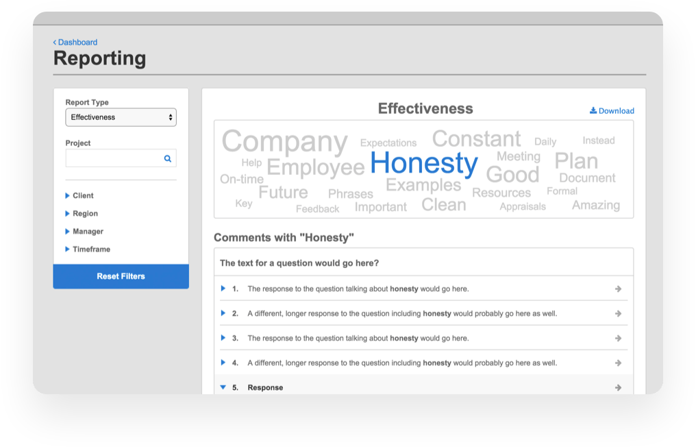
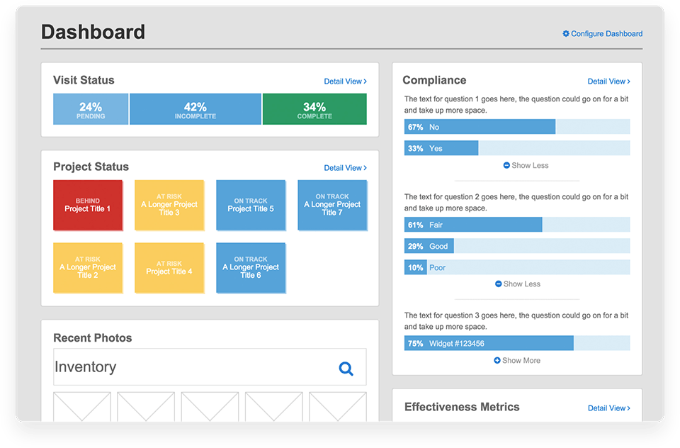

The difference of our research and
planning was shown in the outcome.
We presented the final version of the prototype to Natural Insight, making an effort to explain our new strategy as simply as possible.
At the start of the walkthrough there seemed to be a bit of tension in the room -- a sense that maybe what we had created wouldn’t work -- but everybody started to relax as we made it clear that we’d thought through not only these altered paradigms, but how they might eventually be implemented.
Because of the initial prototype and how well it was received, Natural Insight entered into a new ongoing partnership with 3Pillar to manage and develop their next gen platform.
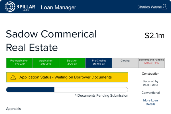
We worked with a Fortune 500 retail bank on their Small Business Lending
platform to help re-imagine the process of making loans larger than $1 million.
Helping small businesses succeed.
A Fortune 500 retail bank was not satisfied with the timeframe and experience that their customers had to deal with when seeking to grow their businesses.
They were looking for ways to shorten the time between application and funding as well as increase transparency of the lending process.
They were struggling, however, to find a feasible solution to these problems.
We started with the people.
During our exploration of the problem we found that there was a large number of people involved in the loan process from start to finish, all with very different duties, functions and timelines.
We met with many of the individuals invovled in the lending process to get a feel for their responsibilities, pain points, and thoughts on the existing process.
Next, we began our “Understanding”
phase to digest what they told us.
We focused on how information flowed between these groups of individuals and what they needed to do with information.
We found that a large amount of the information that these different groups needed to perform their duties was being recreated in each step of a largely paper-based process.
WE FOUND THAT THERE WERE A NUMBER OF SOLUTIONS WE COULD EXPLORE
Which solution was going to be the best return on investment?
What ideas could we explore in the short term that would have good long term potential?
Which solutions would mesh well with the client’s current intitiatives and roadmaps?
It was time to prune down our list to find
the best solution.
We conducted workshops with our client to work together to define what was important in our solution and discuss the different solution avenues that we could explore.
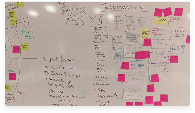
Once we had our definitions we began to explore the solution we felt best answered those problems.
We started in black and white to quickly get our ideas into the hands of the client so we could get feedback quickly.
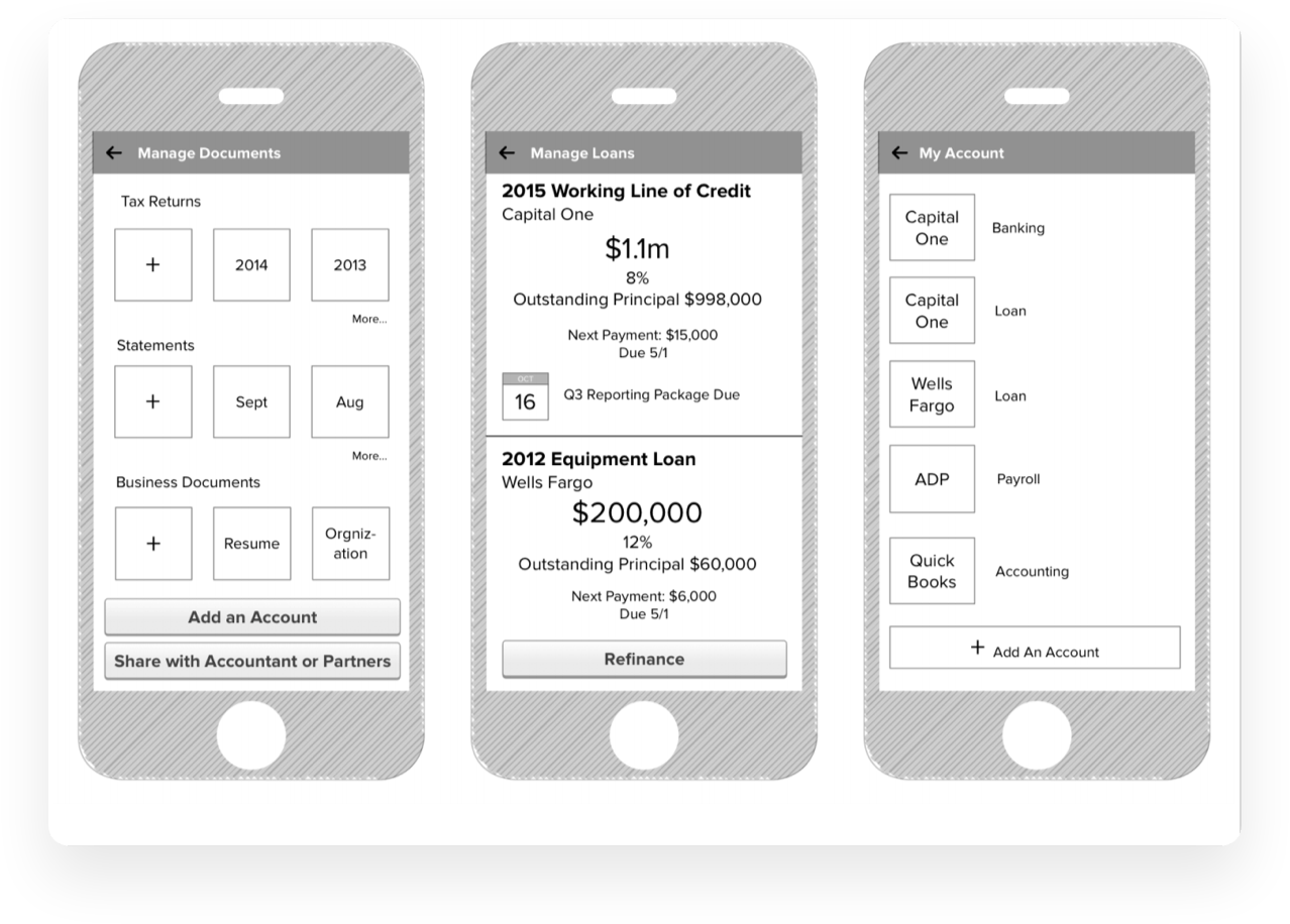
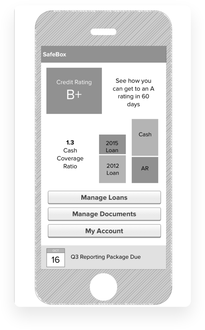
With timely feedback we were able to graduate to a more fully-fleshed out design that showed the expected interaction between members of the Small Business Lending teams that would speed time to close.
We also designed a system architecture that could be used to replace the paper-based system that was currently in place as part of our solution.
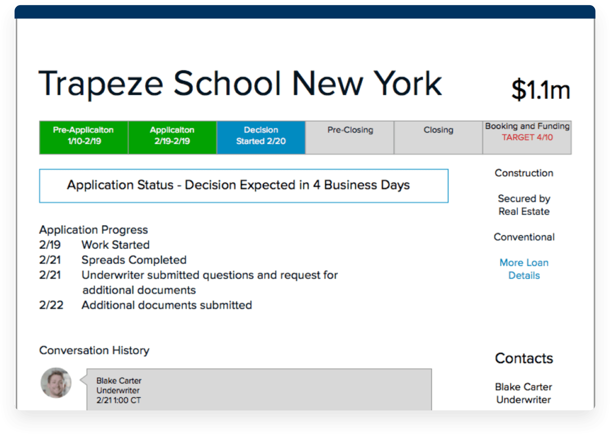
In addition to the Digital Design System, we also created a customer journey map that envisioned the various interaction points a number of parties involved in the loan process would have with the system we designed.
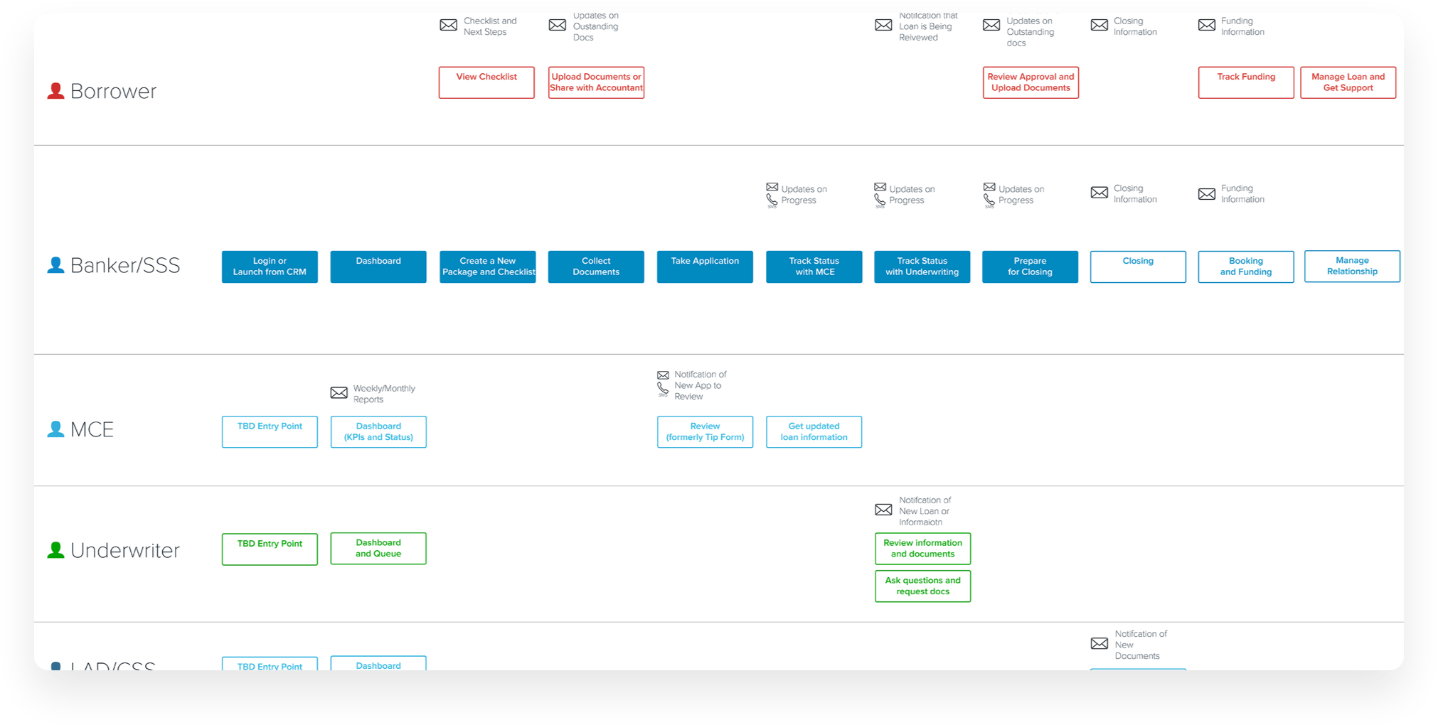
A solution driven by connecting people.
In the end, this project allowed us to envision a more transparent process of lending money that lets people more closely interact with each other instead of systems.
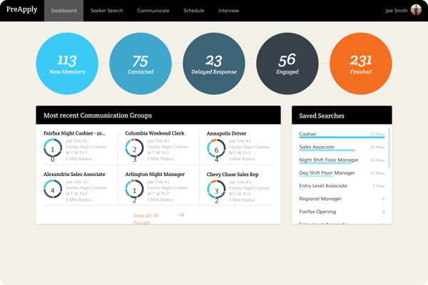
We worked with the SnagaJob hiring platform to get more job seekers in the funnel and allow employers to access their own data more readily.
Helping job seekers find the right jobs.
Our client had the desire to find a way to increase the usefulness of their site for both job seekers and job providers while also increasing revenue.
We began to approach the issue by figuring out how to improve the user experience of job seekers to complete more applications.
With more applications, there would be deeper canidate pools for employers which would attract more job providers.
It was time to talk to job seekers and providers.
 What we found was that both groups were coming up with their own automated workflows for getting more done in one sitting.
 We needed to adjust our thinking.
 Talking with users was showing us that there were many different areas for improvement for creating a better experience for seekers and providers.
 IT WENT BEYOND INCREASING THE NUMBER OF COMPLETED APPLICATIONS.
Reduce process tedium
Improve search & browse
Foster productive closure
Streamline internal workflow
Intercept potential candidates
Create attractive emloyers
Regrouping and Refocusing
In a workshop we led with our client, we let them know what we found out and paired up to brainstorm solutions to the discovered opportunities.
Together, we moved from brainstorming to prioritization to reach our product definition and we now had a much clearer understanding of what needed to be done.
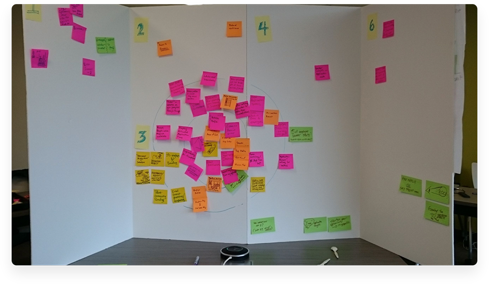
The concensus reached was that focusing on the seeker hourly job search engine as well as the job provider experience would provide the best value.
We had our focus. Then we added guidelines from our research to remember that seekers desired to be able to quickly execute tasks while providers desired a more dynamic interface.
Onto Design and Development
We started rapid design and iterative development of portions of the application to make sure we were aligning with our focus and what our research showed us.
The Search and Communicate sections were particular areas of interest because they directly lined up with what job seekers and job providers desired to do.
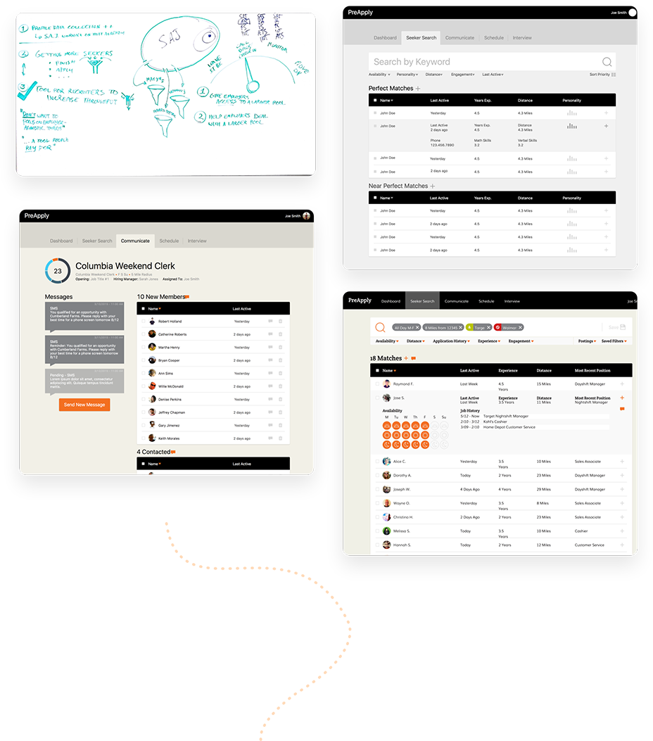
Quickly connecting seekers to employers.
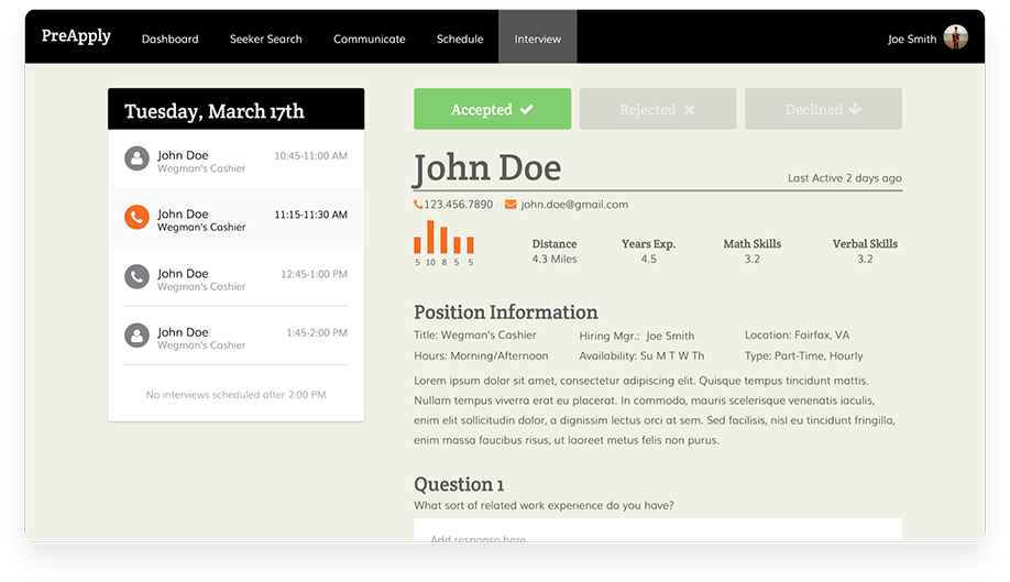
Using our process, we were able to design a system that allowed providers and seekers to communicate on a much faster timetable with an improved toolset.
In the end we had a design that the client is very happy with.
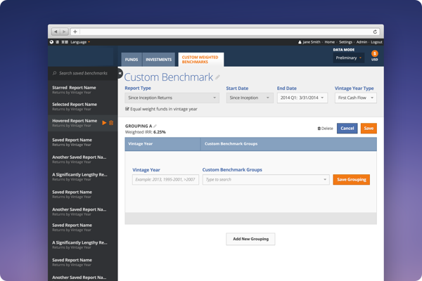
We partnered with a leading investment advisory firm to redesign one of their flagship products. Our partner possesses the most expansive private investment dataset in the world and partnered with 3Pillar Global to give their users a dynamic and precise view into that data.
First, we needed to deeply
understand our partner.
We began by speaking with internal stakeholders to grasp the unique challenges and subtleties of the highly-specialized world of private investing. Quickly grasping this information was critical due to the sophistication of the industry.
As we began to grasp the challenges and opportunities available to us within the product, we quickly moved to interviewing users to discuss its purpose, functionality, and role in their workflow.
Soon, we were discovering insights that were new even to our partner.
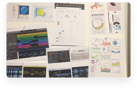
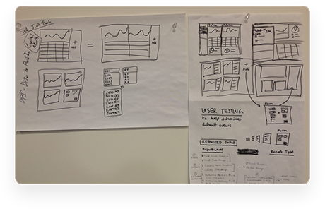

Next, we needed to understand the users.
As our understanding of both our partner and the product expanded, we shifted our focus to getting to know the current product’s users themselves. We needed to discern when, how, and why they used the this tool.
We also researched the needs, desires, and pain points of the tool’s users. Soon, we found there was a unique diversity in the different types of users – some would log in just four times a year, others would spend hours per day logged in.
We quickly saw a challenge in streamlining the interface for heavy users while making it intuitive enough for very light users, and knew that we’d have to strike the perfect balance to make a usable product.
Soon, we were collaborating
and rapidly iterating.
 Once we had a far more thorough understanding of the context of the engagement, we knew we needed to start prototyping and iterating to get feedback from our users. We started with paper prototypes and quickly moved from there to a digital version that we could show to stakeholders.
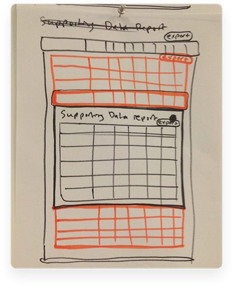
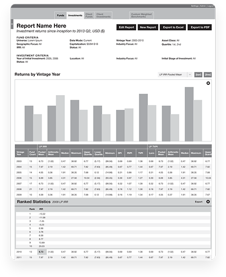
Once we knew we were at least going in the right direction, we showed it to the users.
What they loved, we kept. What they didn’t, we brought back to the drawing board.
Soon, we had a working prototype and were on our way to a first releasable product.
Last, but not least… we polished,
tested, and scaled.
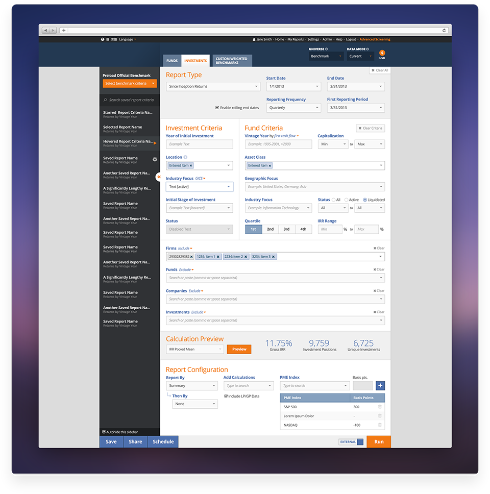
Through the following months, we polished, polished, and polished. A unique visual design named “Steinway” was custom-designed for our partner. Branding, voice, and tone began took shape.
Since we’d designed the product specifically to be able to scale, adding in features was far more streamlined than it might’ve been otherwise. We also ensured that the design was flexible enough for our partner to rebrand for their partners.
Before we went live with the app, we knew we needed to put it in front of users in its beta state. We gave users a specific set of tasks that flexed the product’s muscles, and recorded their reactions. There were a few kinks that we needed to iron out, but overall found that users quickly fell in love.
Shortly after launch, the our work won an Innovation Award at our partner’s global conference in June 2015.
“I think on just about every metric that matters the project has to be judged a big fat success story! I really don’t have the words to tell you all what a wonderful team you have been.”
SENIOR DIRECTOR, PRIVATE INVESTMENT BENCHMARK SERVICES
25th MAY 2018
The revised privacy policy will be effective starting on May 25, 2018.
OVERVIEW
3Pillar Global is committed to protecting your privacy. We are a U.S. company, incorporated in Virginia, with principal offices located at 3975 Fair View Drive, Suite 200 South, Fairfax, Virginia, U.S.A.
We are also a global company and operate through subsidiaries in:
India TPG Private Software Ltd, Noida, Candor Techspace B-2, Tower–3, Sector–62, UP-201309, India Phone: +91.120.468.9200We have prepared this Privacy Policy statement (“Privacy Policy”) to explain our practices regarding the Personal Data (as defined below) we collect from the users of our ”Websites” (3Pillar Global’s website: www.3pillarglobal.com, subdomains: careers.3pillarglobal.com, design.3pillarglobal.com, ijp.3pillarglobal.com, productmindset.3pillarglobal.com, apps.3pillarglobal.com and any other subdomains that may be associated with the 3pillarglobal.com URL, and related web properties: productdevelopmentsuccess.com), how we use and share it, and the rights you have in the processing your information.
This 3Pillar Global Privacy Policy explains:
“Personal Data” means data that allows someone to identify or contact you, including, for example, your name, address, telephone number, and e-mail address, as well as any other non-public information about you that is associated with or linked to any of the foregoing data.
3Pillar Global collects your Personal Data (your “Data”) through two channels:
The elements of your Personal Data that 3Pillar Global collects include:
If you apply for a job position through our website, you consent to sending us your:
We also collect information regarding:
3Pillar Global uses your Data for purposes that could include:
Other than as set out above, you will be notified when 3Pillar Global will share personal information about you with third parties, and you will have an opportunity to choose not to have 3Pillar Global share such information.
3Pillar Global also uses information in aggregate form (so that no individual user is identified):
3Pillar Global uses cookies to help personalize your use of the Website. A cookie is a small piece of information that is sent to your computer’s hard drive by the web server so that the Website can remember who you are. This information may include information relating to your use of the Website, information about your computer such as the computer’s IP address and browser type, demographic data and, if you arrived at the Website via a link from a third party site, the URL of the linking page. If you are a registered user, this may include your name and email address for verification purposes.
3Pillar Global uses information from cookies for purposes that could include:
If you do not want to help us learn how to improve the Website, products, offers and marketing strategy, you may choose to set your web browser to not accept cookies. You can go to the help menu within your Internet browser to manage your cookies preferences.
From time to time, 3Pillar Global could permit third party companies to set cookies on the Website for purposes that could include market research, revenue tracking, or improving functionality of the Website.
How do you disable cookies?
Disabling cookies varies from browser to browser. Below are instructions for how to disable cookies in a variety of modern web browsers.
Disabling cookies in Internet Explorer
Disabling cookies in Google Chrome
Disabling cookies in Safari
Disabling cookies in Firefox
Disabling cookies in Opera 6.0 and subsequent versions
3Pillar Global places paid media advertisements for its services, events, original content, and landing pages on various advertising networks and social media platforms. These may include LinkedIn, Google AdWords, Facebook, Twitter, AdRoll, and similar services. 3Pillar Global may place tracking code or tracking pixels from third-party providers on the Websites for the purposes of serving relevant content to visitors to the Websites.
3Pillar Global uses Marketo for marketing automation and has Marketo’s Munchkin tracking code deployed across the Websites to track actions taken on emails sent by 3Pillar, the Websites’ visitors web browsing activity, and content downloads.
3Pillar Global uses Google Analytics and Google Tag Manager to track the behavior of visitors on its Websites.
3Pillar Global will keep your personal information only as long as is reasonably necessary for the purposes described in this Policy or such longer period as may be required by applicable law.
The Internet is a global environment. Using the Internet to collect and process personal Data necessarily involves the transmission of Data on an international basis. When 3Pillar Global collects personal information from you on the Website, 3Pillar Global complies to several self regulatory frameworks, including the EU-US and Swiss-US Privacy Shield Frameworks.
If you are a non-U.S. user of the Site, by visiting the Site and providing us with data, you acknowledge and agree that your Personal Data may be processed for the purposes identified in the Privacy Policy. In addition, your Personal Data may be processed in the country in which it was collected and in other countries, including the United States, where laws regarding the processing of Personal Data may be less stringent than the laws in your country. By providing your data, you consent to such transfer.
Individuals located in the European Economic Area, have certain statutory rights in relation to their personal data, according to the
European Regulation EU 2016/679 (GDPR). Subject to any exemptions provided by law, you can exercise your data protection rights towards us in the following ways:
For a quick resolution to your problem, we ask you to send a written request about exercising your rights to the following address or directly to our data protection officer, at the following e-mail address:
Data Protection Officer
3Pillar Global SRL
The Office Cluj Napoca, Bulevardul 21 Decembrie 1989, No. 77, Entrance B, 5th Floor, Room 5.1,
Cluj Napoca, Cluj County, Romania
Phone: +40364.885.798
Fax: +40364.402.269
Email Address: info@3pillarglobal.com
The information provided, as well as any communication and measures taken by you to exercise the above rights, are provided by 3Pillar Global free of charge. However, if your claims are unfounded or excessive, especially because of their repetitive nature, 3Pillar Global may: (i) either charge a fee based on the administrative costs of providing the information or communication, or to take the required measures; (ii) refuse to comply with the request.
3Pillar Global has appropriate measures in place to help ensure that Website users’ data is protected against unauthorized access or use, alteration, unlawful or accidental destruction and accidental loss.
3Pillar Global uses administrative, organizational, technical, and physical safeguards to protect the Personal Information we collect and process from loss, misuse, or alteration by third parties. You should be aware that there is always some risk involved in transmitting information over the Internet.
Our security controls are designed to maintain an appropriate level of data confidentiality, integrity, and availability.
The Website is not intended for use by persons under sixteen (16) years of age. 3Pillar does not intentionally collect any information on children under sixteen (16) years of age. 3Pillar Global will undertake to delete any details of such users where a parent or guardian has notified 3Pillar Global that any such details have been obtained.
If you believe that we might have any Personal Data from a child under 16, please contact us at info@3pillarglobal.com.
All four 3Pillar Global companies are collectively responsible (“joint controllers”) for data processing according to Art. 26 GDPR (General Data Protection Regulation). Upon request, we will gladly provide a summary of the basic conditions of this joint controller contract. Despite their joint responsibility for data processing, the four 3Pillar Global companies cannot act as legal representatives for one another.
Links to third-party websites on this Website are provided solely for your convenience. If you use these links, you leave this Website. 3Pillar Global has not reviewed all of these third-party websites and does not control and is not responsible for these websites or their content or availability. 3Pillar Global therefore does not endorse or make any representations about them, or any material found there, or any results that may be obtained from using them. If you decide to access any of the third-party websites linked to this Website, you do so entirely at your own risk.
Please be aware that the terms of this Privacy Policy do not apply to these outside websites or content, or to any collection of your Personal Data after you click on links to such outside websites. We encourage you to read the privacy policies of every website you visit.
This data protection information was updated on 8th of May 2018. 3Pillar Global reserves the right to update this data privacy information periodically.
Copyright © 2018 3Pillar Global, Inc. All Rights Reserved.

